

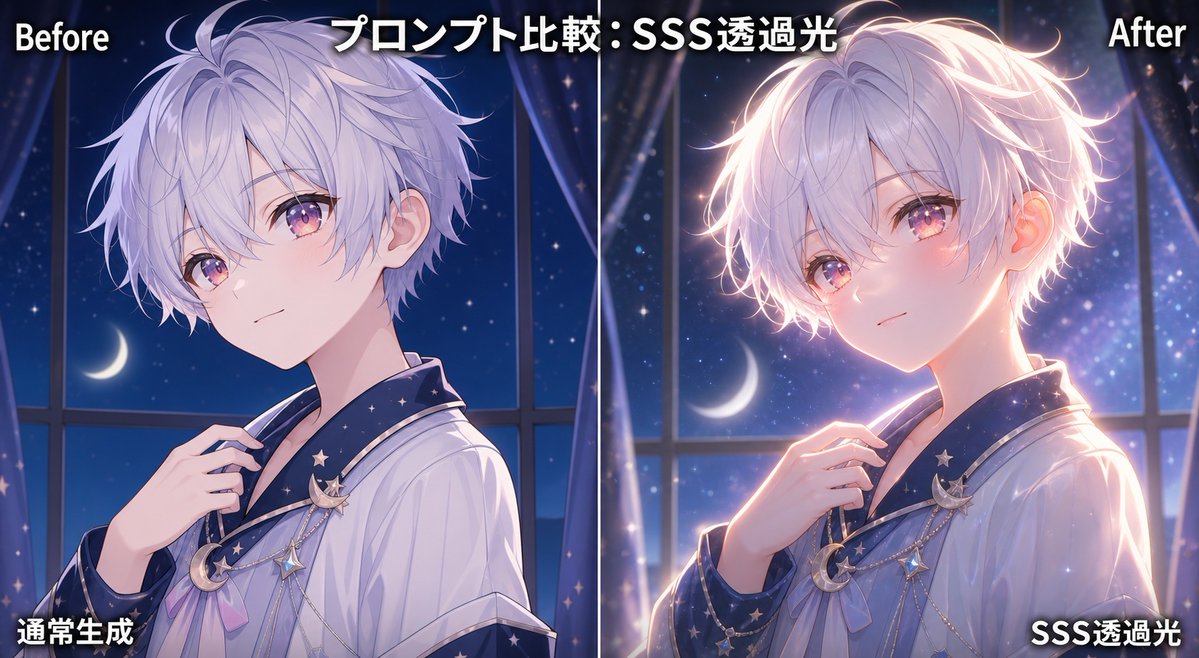
Goal: Create a side-by-side anime illustration comparison demonstrating subsurface-scattering translucent light, with the same character shown in two vertical panels: a normal version on the left and an enhanced glowing version on the right.

Canvas: Wide 16:9 social-media comparison image, about 1200×675 px, split exactly down the center by a thin vertical white divider line. Use a dark blue nighttime color palette with strong contrast between the left “Before” and right “After” lighting.

Layout: Two equal panels. Top left label reads “Before” in bold white text with a black shadow. Top center headline reads “プロンプト比較:SSS透過光” in large bold white Japanese text with a dark outline. Top right label reads “After” in bold white text with a black shadow. Bottom left caption reads “通常生成” and bottom right caption reads “SSS透過光”, both in bold white Japanese text with black shadow. Keep exactly 5 text elements: 1 Before label, 1 Japanese headline, 1 After label, 1 bottom-left Japanese caption, and 1 bottom-right Japanese caption.

Subject details: Show the same youthful anime boy in both panels, upper body portrait, three-quarter pose facing slightly left, slim build, pale skin, short fluffy lavender-silver hair with many soft strands, visible ear, delicate neck and hand, wearing a loose white robe or pajama-like shirt with a dark navy star-patterned collar. Add celestial accessories on the chest: exactly 3 visible hanging ornaments, including a crescent moon brooch, a small star charm, and a dangling chain detail. His right hand lightly holds the collar near the chest. The face is intentionally covered by a large opaque square privacy block centered over the head in both panels; use a muted lavender-gray square on the left and a warmer pink-lavender square on the right.

Background: Both panels show the same dreamy bedroom/window scene at night: tall window frames, dark navy starry sky, a crescent moon visible behind the character, sheer curtains, tiny sparkles and soft bokeh. The left panel should feel cooler, flatter, and less luminous. The right panel should feel more cinematic and premium, with warm rim light and glowing particles.

Lighting comparison: Left panel is normal generation with soft cool moonlight, subdued shadows, minimal translucency, hair edges mostly matte, ear and cheek not glowing. Right panel adds dramatic SSS translucent light: warm pink-orange light appears to pass through the ear, cheek area, fingertips, and hair edges from behind, creating a halo rim around the hair, warm bloom on the skin, luminous outline on the shoulder and hand, and more depth. Emphasize transparency, dimensionality, and high-quality anime rendering on the right without changing the character pose.

Visual style: High-end Japanese anime illustration, soft painterly rendering, clean line art, glossy hair highlights, dreamy blue-purple night atmosphere, subtle magical sparkle effects, crisp readable typography, polished comparison graphic suitable for an AI art tutorial post.

Customizable variables: Use [headline text], [character description], [left caption], [right caption], and [lighting effect].

Constraints: Keep the two character portraits nearly identical in pose and outfit. Include exactly 2 large face-covering squares, one in each panel. Do not add extra panels, extra captions, watermarks, logos, or unrelated objects.


0 Comments
👥 Co-learning Circle 0
Observe other members' variables & configurations, and click "Study & Retry" to instantly import settings and practice!