

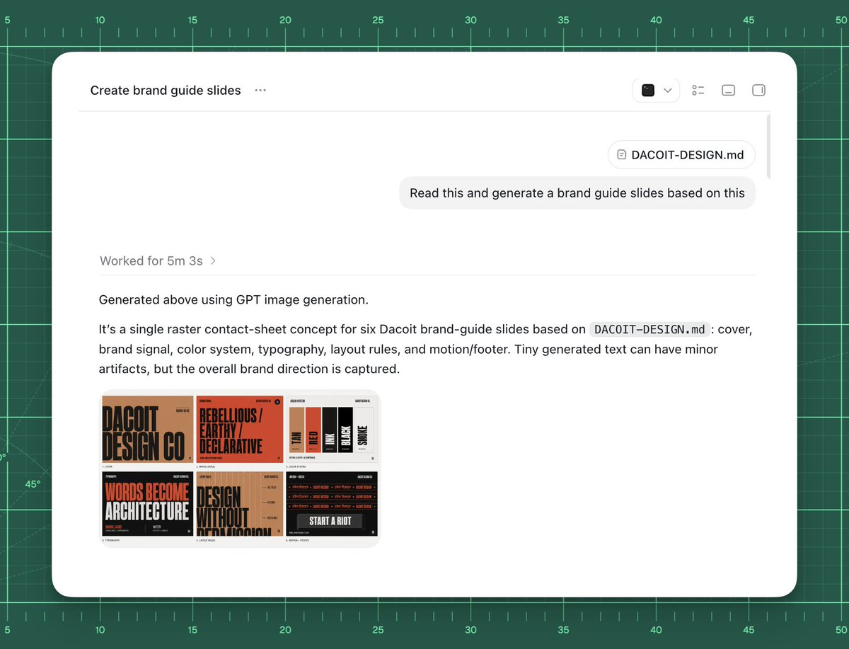
Goal: Create a polished screenshot-style UI mockup showing an AI chat or agent workspace successfully generating brand guide slides from a markdown file.

Canvas: 4:3 landscape composition, approximately 1024×768. Background is a dark green cutting-mat grid with ruler markings around the top and left edges, thin mint grid lines, measurement numbers from 5 to 50, small tick marks, and a few faint diagonal guide lines. Center a large rounded white app window with a soft shadow, leaving the green grid visible as a border.

App window layout: The white panel has rounded corners and a minimal toolbar. At top left, show the title text “Create brand guide slides” followed by a three-dot menu. At top right, include exactly 4 small toolbar icons: a dark square icon with a dropdown chevron, a list/settings icon, a small rectangle icon, and a split-panel icon. A thin horizontal divider runs under the toolbar. Near the upper right of the chat area, show a rounded attachment chip labeled “DACOIT-DESIGN.md”, then below it a light gray user message bubble reading “Read this and generate a brand guide slides based on this”. Add a subtle vertical scrollbar on the far right inside the window.

Main response content: In the left-middle area, show a muted status line “Worked for [processing time] ›”. Below a divider, show the response text: “Generated above using GPT image generation.” Then a paragraph: “It’s a single raster contact-sheet concept for six Dacoit brand-guide slides based on `DACOIT-DESIGN.md`: cover, brand signal, color system, typography, layout rules, and motion/footer. Tiny generated text can have minor artifacts, but the overall brand direction is captured.” Use clean modern sans-serif UI typography, black and gray text, generous spacing.

Embedded generated image thumbnail: Under the paragraph, place one rounded-corner thumbnail preview of a six-slide brand-guide contact sheet. It must contain exactly 6 mini slide panels in a 3×2 grid. The style of the mini slides is gritty editorial branding with tan, burnt orange, black, cream, and red. Count and depict the six visible slide topics: 1) cover slide with huge text “DACOIT DESIGN CO”, 2) brand signal slide with “REBELLIOUS / EARTHY / DECLARATIVE”, 3) color system slide with vertical swatches labeled roughly TAN, RED, INK, BLACK, SMOKE, 4) typography slide with large words “WORDS BECOME ARCHITECTURE”, 5) layout rules slide with “DESIGN WITHOUT APOLOGY”, 6) motion/footer slide with dark background and “START A RIOT”. The tiny text may be imperfect but the large labels should be recognizable.

Visual style: High-fidelity product screenshot, crisp white interface, subtle shadows, realistic browser/app chrome, minimal monochrome icons, sharp readable text, clean spacing. The background should feel like a design workspace or drafting mat.

Customizable source/brand details: Use [project title] as the window title if changed. Use [file name] for the attachment chip and paragraph reference. Use [brand name] for the brand guide subject. Use [user request] as the message bubble text.

Constraints: Do not add people, hands, browser address bars, extra popups, watermarks, or unrelated UI. Keep exactly one app window, one attachment chip, one user message bubble, one status line, one response paragraph block, and one embedded thumbnail containing exactly six mini slides.


0 Comments
👥 Co-learning Circle 0
Observe other members' variables & configurations, and click "Study & Retry" to instantly import settings and practice!